The fonts on a website help communicate the personality of the brand and message, and there are so many good fonts for websites to choose from.
Website fonts give the user an immediate initial impression. They give the personality and the vibe to the web design.
Choose the wrong font, and your website might look like a joke. Choose the right font, and you can potentially increase your conversion rate. Here we’ll explore tips and guidelines for picking the right fonts for your website.
TABLE OF CONTENTS
HOW TO CHOOSE A FONT
What are the most popular website fonts and font families? How many different fonts should you use on a web page? What are some good font combinations? These are some of the most frequently asked questions we hear from our clients.
Quite often for established businesses, there will already be a brand look you will want to tap into and this will guide the fonts you use for the website. For new businesses or new projects just getting a website, all possibilities are open and it's a matter of trying to match your intent for your business or project and reflect that on your website.
Designing a good-looking website is all about striking a balance between design and usability. Finding a good font for your website is one way you can achieve this, since a well-designed typeface can both set the tone for a website and make it easier for users to both read and navigate which, along with good content, will help to keep them on your website for longer and come back again and again.
Important aspects to consider when choosing a website font are:
MOOD
Creating the right mood will set the personality of your website, and different fonts offer different messaging.
DESIGN
This can include using different font pairing, different font weights of the same font and using colour to add style and individuality.
READABILITY
Possibly the most important aspect, whatever font you choose it needs to be readable or people will simply click away from your website if they can't get at the information they came for.
CHOOSING THE STYLE OF FONT
There are several categories of font and each has its own style, and character, and therefore communicates a different message. Typography is an art form, and we're lucky to be able to benefit from so many great fonts, but this also makes the decision difficult at times too! We need to consider the brand, the website visitors, and the message we're trying to convey.
The two main font types are serif and sans serif. There are a number of other styles too, but they are generally used sparingly if at all.
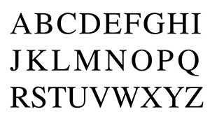
SERIF FONTS
These fonts have extra flourishes and detailing which makes them more intricate and stylized. They look more like traditional typefaces seen in printed works. Serif fonts are considered more formal and traditional. It is common to use serif fonts on websites for businesses such as corporate, medical or legal organizations because serif fonts give a sense of formality and professionalism.
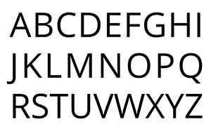
SANS SERIF FONTS
These fonts are simpler and don't have the extra flourishes. They give a more modern feel and are popular in website design and are used as the main font as well as headline fonts. Sans serif fonts are very versatile and can be used for almost all web pages. They can be casual, or along with other design elements such as colour spacing etc. they can create as serious although less formal mood as serifs. Sans-serif fonts are useful for websites with a less formal tone, such as travel blogs, food sites, health and fitness website and many
Other font styles include cursive scripts and casual fonts.
CURSIVE FONTS
These fonts are similar to handwriting and can be good for accent fonts such as headlines or other stand out text. They are usually harder to read in large chunks so are not a good choice for the main body font. Cursive fonts can add a mood of class and luxury, a high-end appeal. They can also add a feminine atmosphere when used with other design elements.
CASUAL FONTS
This type of font is informal, friendly, and simple but it can sometimes come across as childish or unprofessional if not used correctly. However, in some circumstances it might be just the right thing, for example for goods or services aimed at children.
CHOOSING THE RIGHT FONT
We are all programmed to recognise and associate, and not choosing the right font can have unintended consequences.
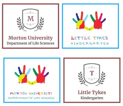
Ok this is a little exaggerated. Just a bit. But it does highlight very clearly how fonts influence our perceptions and why taking the time to find what fits your website, company and brand is important.
FINDING GOOD FONTS FOR WEBSITES
There are many good fonts for websites and they are available in different delivery formats too.
Font files can be uploaded onto your website, or your website can be hooked up to an online website font library to access fonts.
The largest and most popular font library is Google Fonts. The fonts are free, easily integrate into web coding, it offers a huge selection of hundreds, if not thousands, of different font styles and is a stable platform. It is a hugely popular option.
Using premium website fonts potentially offers more versatility and individuality. Adobe Fonts is a popular premium fonts service. You will need to buy each font weight separately and prices currently range roughly from about £10 to £100 per font per weight. If you want to be truly unique you can get a custom font designed specially for you by a type designer.
WHAT FONT IS THIS?
If you find a font on a website that you like the look of, you can easily find out what it is. If you are using a Chrome browser, download the What Font? extension. Then to activate it click on the icon, hover over the font you want to find out about and it will tell you want it is.
TOP WEBSITE FONTS
It's interesting to note that the Top 10 Most Popular web typography fonts on Google Fonts are sans serifs – you can get the current list of most popular fonts by choosing them in the Sort By dropdown.
Some evergreen popular web fonts are -
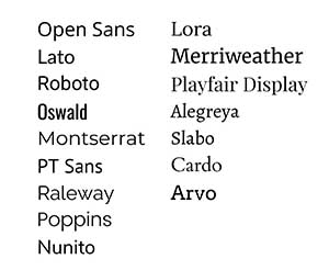
Open Sans - a popular font for a while, it has a number of variations including condensed and light which makes it very versatile.
Lato - elegant and modern curves with an air of simplicity which makes it perfect for both websites and social media posts where space is limited.
Montserrat - best used at larger sizes, such as headings or display type due to its dramatic look.
Merriweather - feels traditional and modern at the same time, a serif font, it is easy to read on screens even at a small size.
Futura - a popular sans serif font of the 1920s it is still popular as an internet font, and distinctive enough to be used as a heading and body font.
Playfair Display - a traditional looking serif font, it is ideal for headings and as a display font, as the name implies.
Alegreya - originally intended for literature this serif font has loose spacing and a calligraphy feel.
Roboto - last but by no means least, Roboto is a sans serif that's easy to read and with many variations. It's one of the most famous fonts and a popular default font for Android, Google, YouTube and more.
FONT PAIRINGS
It is never a good idea to use too many web fonts on a web page, because it can make the page look too busy, disjointed, and therefore difficult for users to read, diminishing the user experience.
One font can be enough and using different weights of that font can add contrast and create style as well as a good user experience.
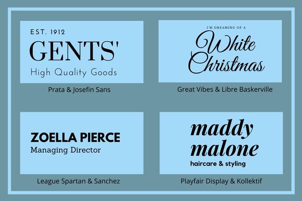
Font pairings is using two fonts in the same design or next to each other. Such font combinations are a popular trend right now and if subtly done can add interest to your website without overwhelming your visitors.
Quite often a simple font such as a sans serif will be combined with a serif or cursive font. The simpler font being for the main sections of text and the more decorative font being for headlines or stand out accent text.
Some examples of popular font combinations include:
VERDANA & HELVETICA
These are both sans-serif fonts. If you want to get a more edgy feel or something modern for your audience then this is a good combination of fonts to use.
ROCKWELL & GEORGIA
These may be a better choice if you're looking for something fancier or more old-world with embellishments.
When searching Google Fonts, it offers suggestions for good font pairing and you can also find suggestions at dedicated sites such as FontPair.
SITE SPEED
One important thing to consider when deciding which web font(s) to use is that custom fonts will generally need to be hosted on your website and if you have too many of them they may slow your website load speeds. And slow sites lose visitors. It has been found that if a web page takes longer than 3 seconds to load it will lose visitors as they will simply click away. Because of this Google, who wants to give users the best possible experience, penalise slow loading websites in rankings.
FINAL THOUGHTS
Remember - to choose the right web font for your website think about the message you are trying to convey, your business and industry, your target audience, the personality of your brand, and of course legibility.
Everyone wants their website to be individual, unique and stand out but few want that to be for being a joke when it's not intended. Not many companies can get away with the likes of the spectacular rule breaker Ling Cars website! A real favourite around here for the sheer audacity!
There's no such thing as the best font necessarily, and it depends if you're after elegance or a retro look, if it's for a logo and graphic design or for plain body text. If you aren’t sure, your web designer will always be able to suggest good options, as they are used to working with many good fonts for websites, and you can have faith that they will get the right look.
If you're interested in getting to know fonts better, a great place to start is with Pimp My Type.
Good Fonts For Websites last updated October 2022


